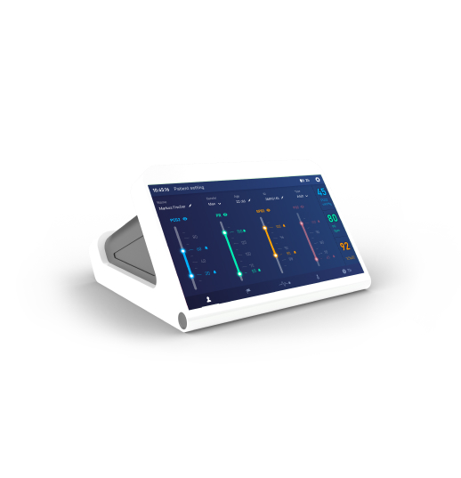
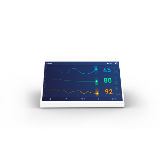
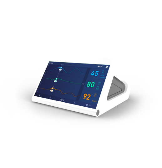
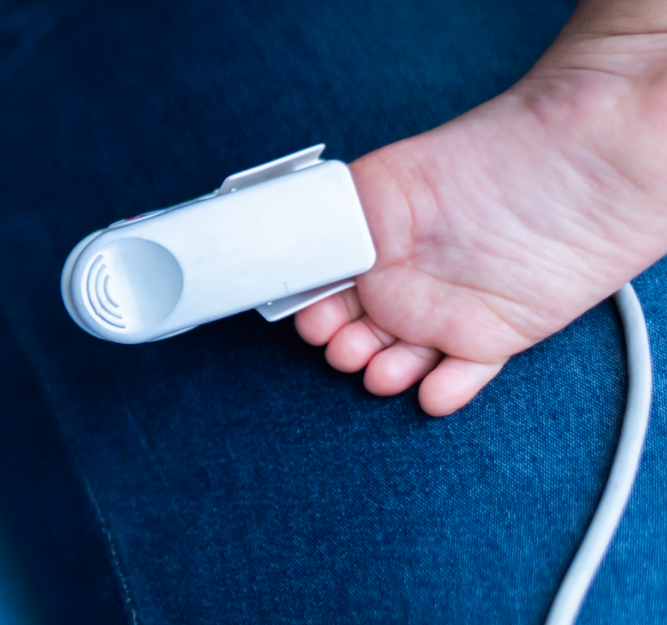
Monitoring the condition of premature and neonatal infants is especially important for initiating treatment in a timely manner. Every minute counts and delays can have serious consequences.
However, frequent blood sampling is difficult to implement for this target group. This is where this blood gas monitor comes in, and we were able to successfully support its development with our Data Driven UX Design approach right from the start.
Initial situation & project
There are two main ways to determine blood gas levels: regular blood sampling or the use of monitoring systems. However, these have often been complex and have provided little support to staff in their use. This is especially true for devices that can be used in neonatal scenarios.
The goal of the project was to design a completely new blood gas monitor from the ground up. We were responsible for the user interface design, the housing design and all usability studies.
Our approach
01
On-Site Visits
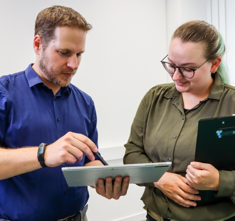
The project began with on-site visits to learn about the working environment and processes of local health care professionals. In particular, we focused on the current workflows in the use of blood gas monitoring devices and how they could be improved.
We learned a lot from these on-site visits, which helped us throughout the rest of the project.
02
User Interface Workflows & Wireframes
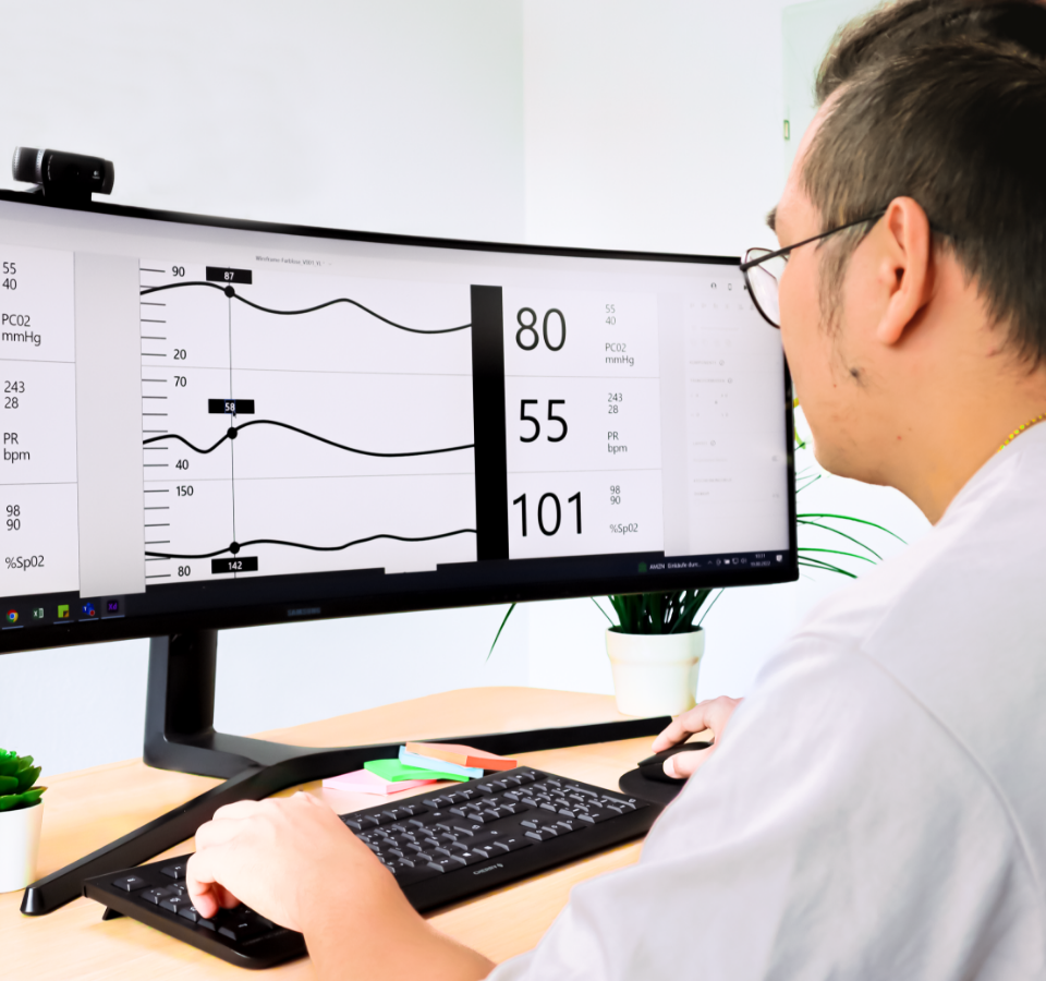
Based on all the information gathered during the on-site visits, we decided on improved workflows for the new blood gas monitor.
These workflows were then translated into initial wireframes and an early user interface prototype. This allowed us to present the workflows to stakeholders. We also ensured that we could test with future users in subsequent formative evaluations.
03
Housing-Wireframes
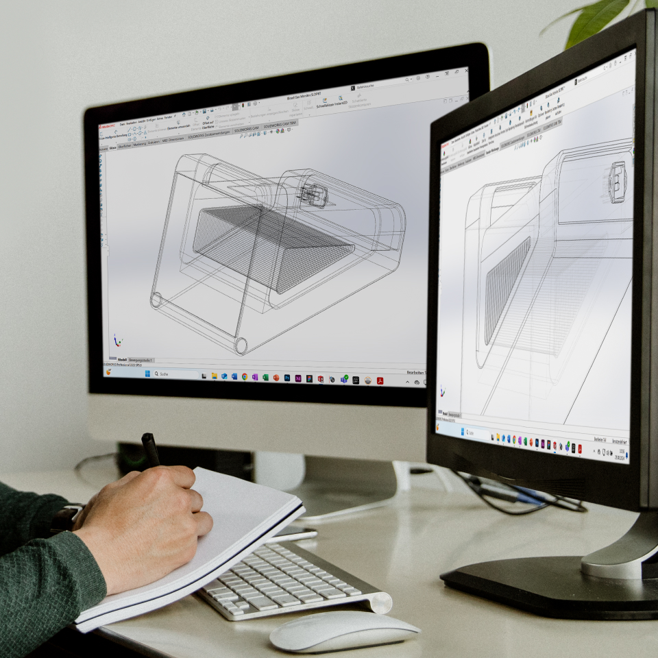
The feedback went directly into the next iteration. While we were working on the user interface, we also started designing the housing. We took a similar approach, starting with wireframes and basic models. We then printed the models on our 3D printers to have a physical form to discuss with stakeholders. Feedback was directly incorporated into the next iteration. The physical models were also used in subsequent formative evaluations.
04
Formative Evaluations
Based on the wireframe prototype of the user interface and the housing, we started the first formative evaluations. We invited healthcare professionals to our labs to test the workflows and 3D models and give us feedback. This feedback was incorporated into the prototypes and presented to other healthcare professionals in a second formative evaluation. Our goal was to gather as much feedback as possible at an early stage of development and incorporate it directly into the user interface and housing.
With each iteration, the user interface and enclosure design became more finalized – incorporating user feedback and advancing the visual design.
05
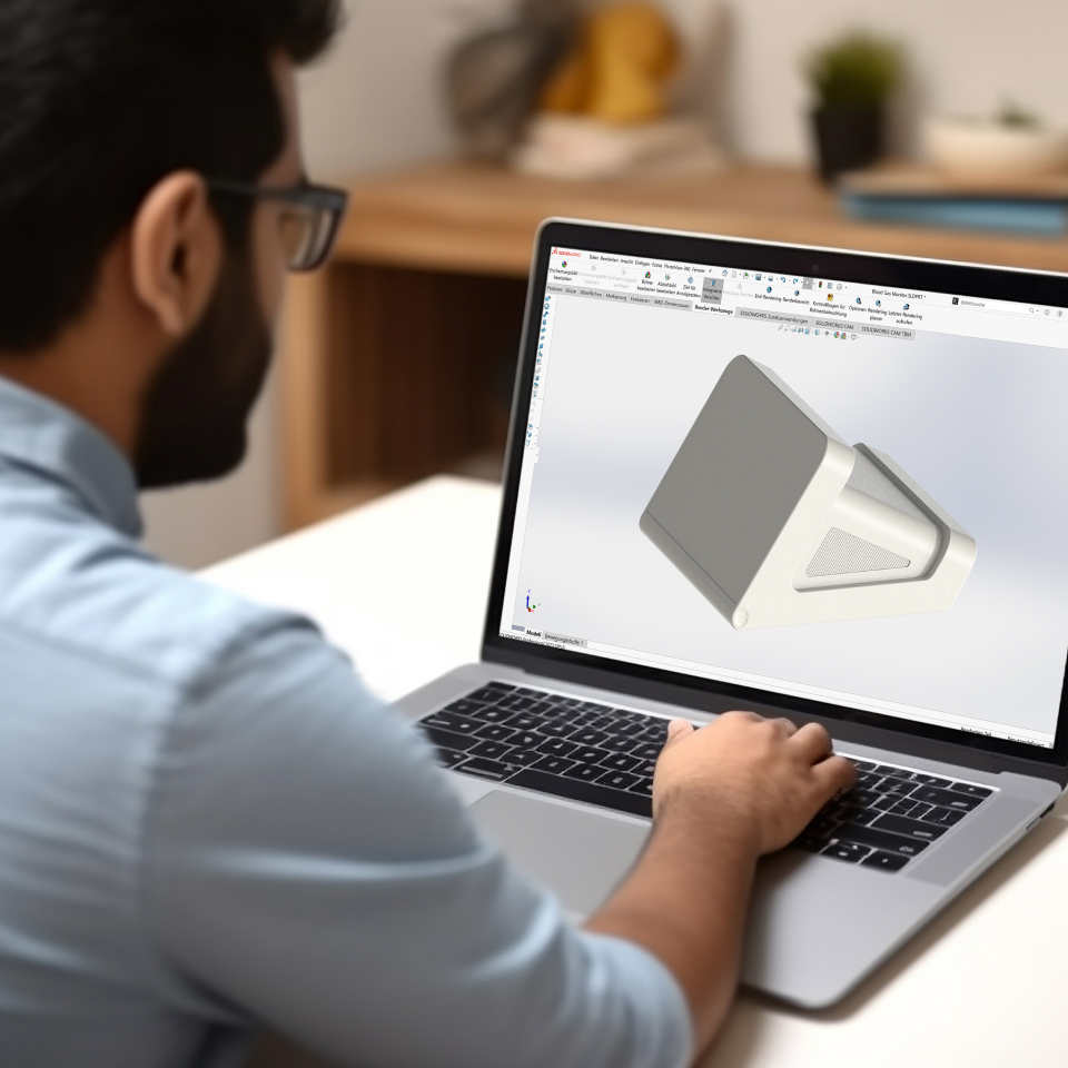
Finalizing the Housing Design
With the formative evaluations conducted, we had a strong data base to move to the next step: finalizing the housing. Our goal here was to maintain usability and user experience combined with manufacturability.
06
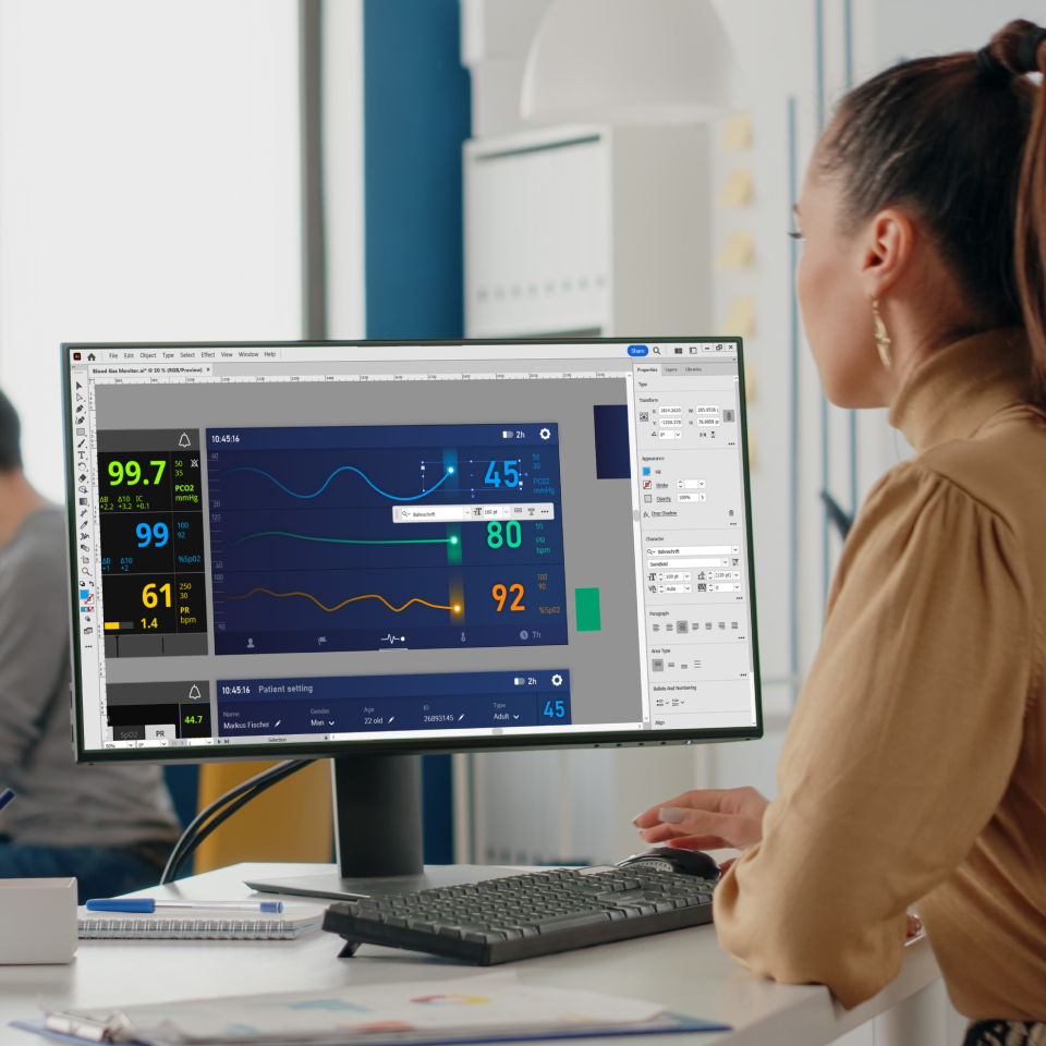
Finalizing the Visual Design of the User Interface
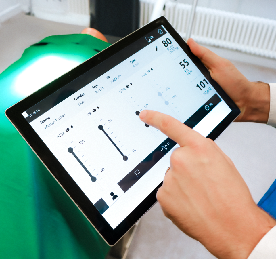
The same process was applied to the visual design of the user interface. Based on the strong data from the formative evaluations, we were able to complete the visual design quickly. We also created all the elements and design assets to speed up the development process.
07
The Result
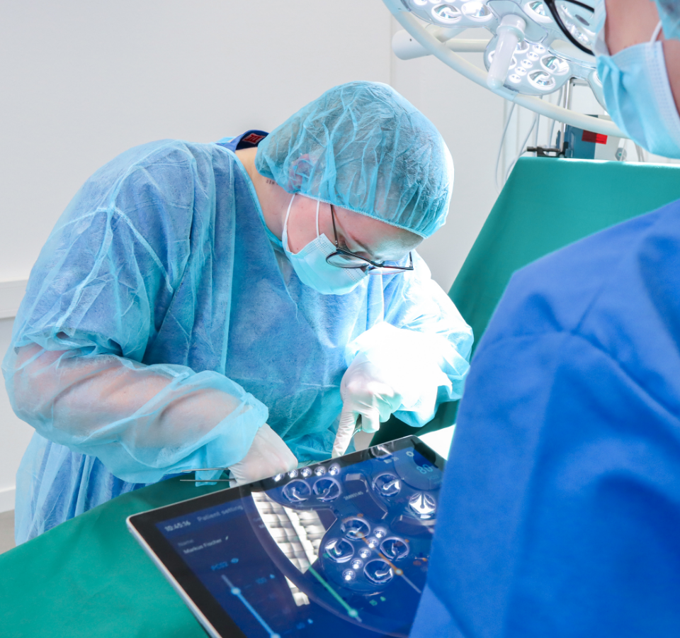
The new blood gas monitor relies on direct manipulation and thus enables all important functions to be reached within a few clicks. The appealing design of the housing and the user interface inspires users. The overall feedback we received is great.
Let’s get to know each other
Do you want to work together quickly, purposefully and respectfully at eye level? Let’s talk about your challenges in an uncomplicated way and find out together how we can support you. Arrange your first free and non-binding get-to-know-you meeting now.

