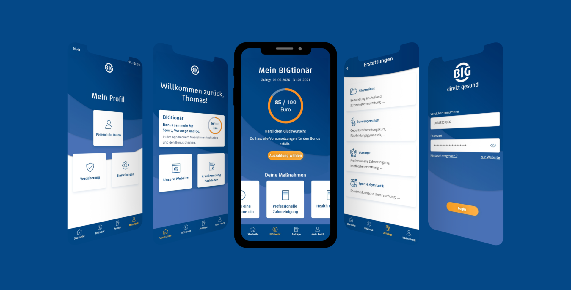
Interacting with the health insurance company simply, quickly and without red tape. That’s what many people want. BIG makes it possible with its “meineBIG” app. Of course, such an app should be easy to use and offer a positive user experience.
We focused on the user and developed an optimal UX. Find out how we achieved this, what the hurdles were and what exactly our approach was in this case study!
Initial situation
The existing app should be replaced with a better, more intuitive app. The application should convince with very good service. In addition, the competition was launching new apps and it was necessary to “catch up” with the competition.

Our approach
01
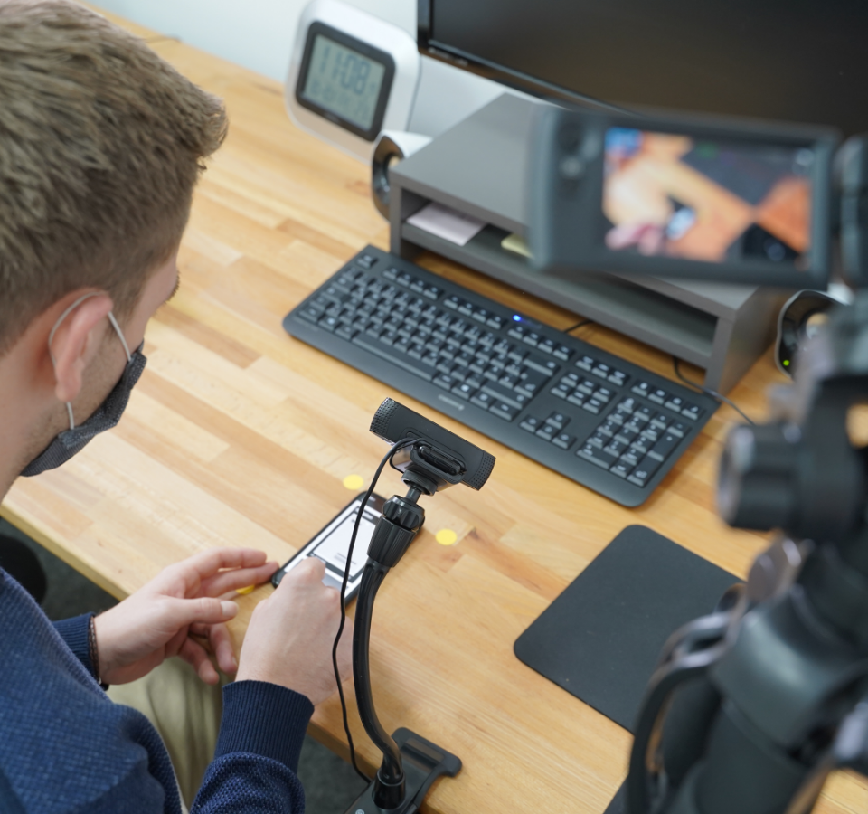
First wireframes and formative evaluations
With first wireframes an early version was tested on concept level with real users.
In these first tests, the user perspective was much better understood and the problems of the own users could be defined more clearly.

02
Wireframes
Complex processes (such as applications for family inventory maintenance) had to be mapped simply. In addition, many of these processes are very extensive due to legal requirements.
Despite many variables, the use cases were to be mapped in a user-friendly manner.
03
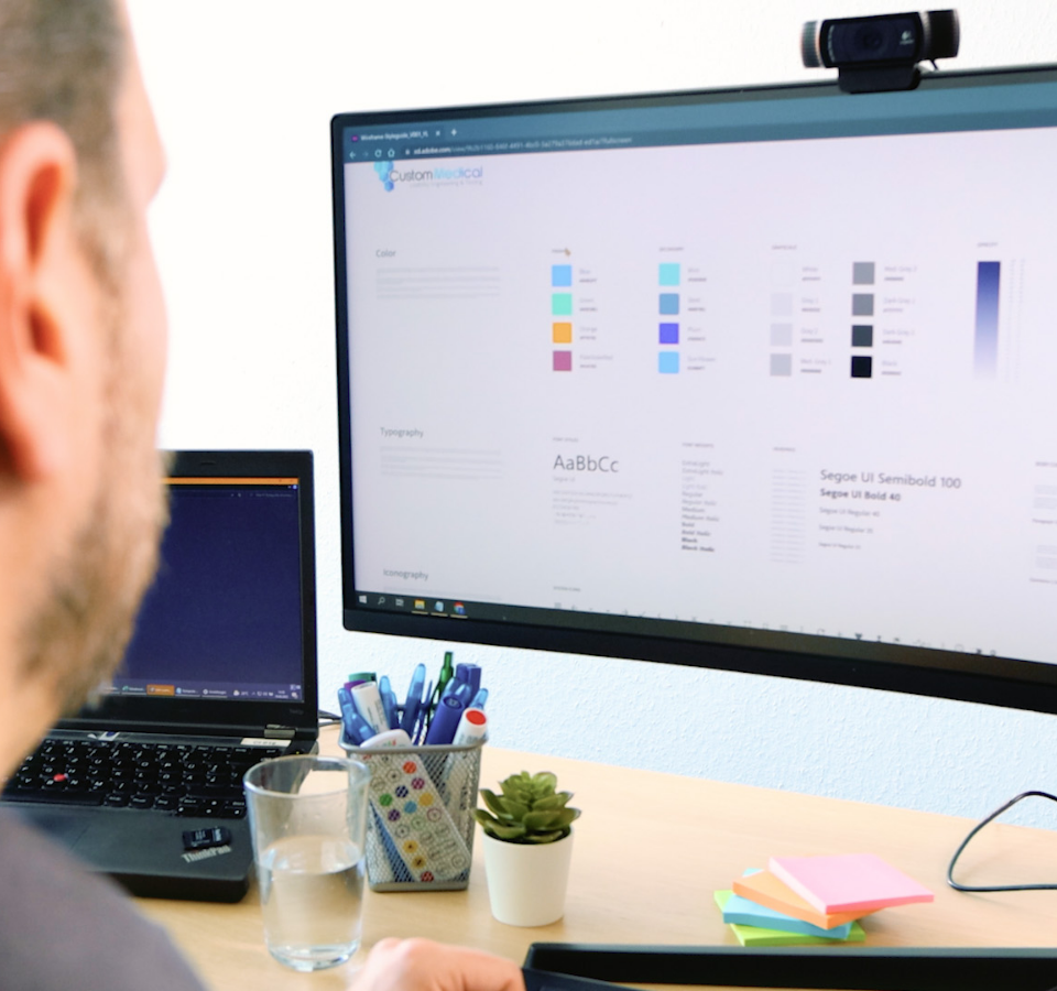
Visual Design
Taking into account the new navigation, in addition to the interaction concept, a visual look and feel was designed that is based on the existing style guide of BIG Direkt.
Nevertheless, it also takes liberties to reflect a light, round and inviting design that remains consistent to BIG Direkt across media types.
04
The result
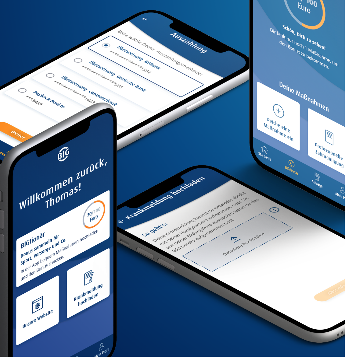
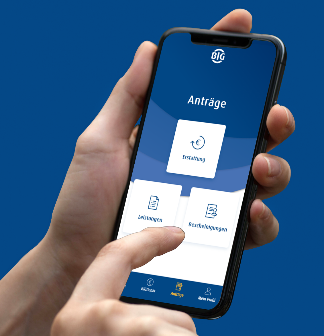
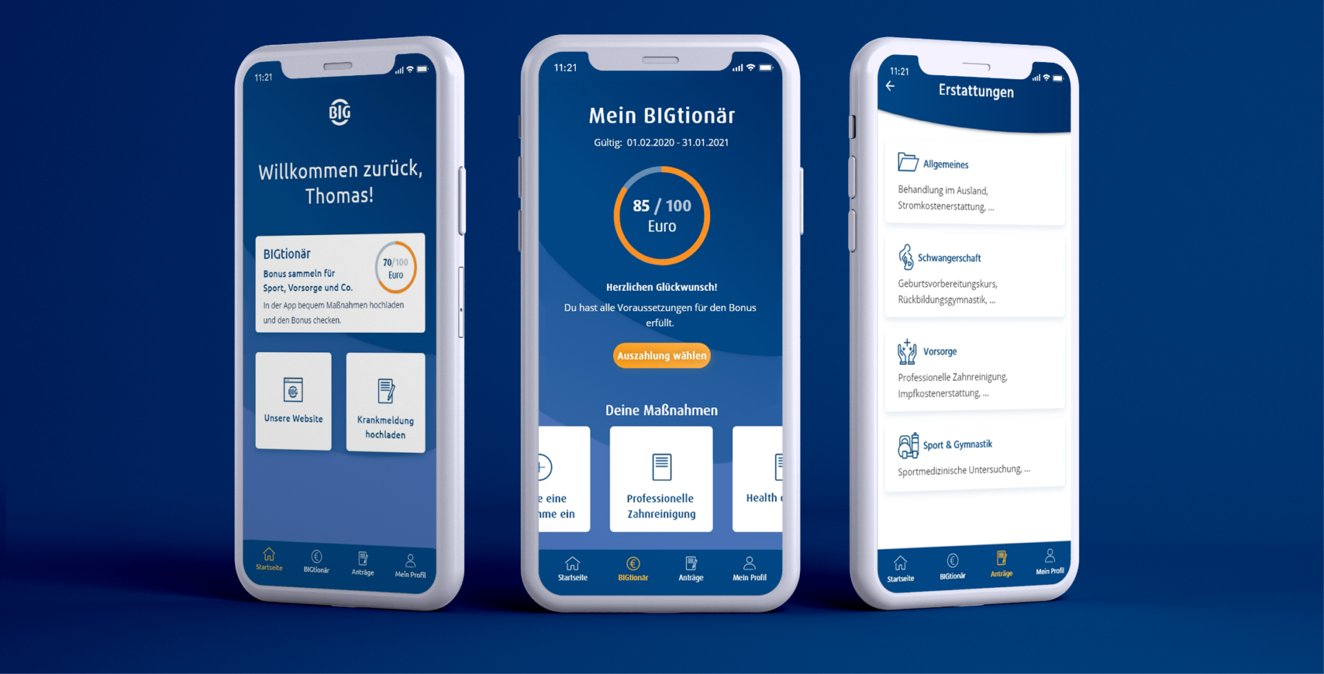
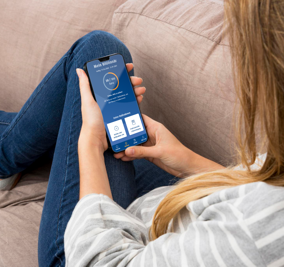
A fresh and clear look. The design represents the BIG very well. The workflows for key functions are now much simpler.
The end result is a clearly structured service app.
Let’s get to know each other
Do you want to work together quickly, purposefully and respectfully at eye level? Let’s talk about your challenges in an uncomplicated way and find out together how we can support you. Arrange your first free and non-binding get-to-know-you meeting now.

